
HelloEdit: The demon child of a Markdown editor, Microsoft Word 5.1, and Macintosh System 7
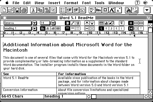
Recently, I booted up Mini vMac, an emulator for classic Macintosh computers from the 1980s, and set up System 7 with Microsoft Word 5.1a, running on a Macintosh Plus. This replicates the first computer I ever used, a retired Macintosh Plus from mum's office. My parents inexplicably set it up in the laundry, and I spent a lot of time writing 'novels' in Word and drawing weird abstract art in MacPaint.
 Hello, old friend.
For a certain section of the internet, Word 5.1a is as good as word processors ever got. Indeed, as Kevin Lipe writes in the last article linked there, Word 5.1a embodied many features of Jon Gruber's Markdown - it kept out of the way while typing, it had only the bare minimum of formatting features, and it opens almost instantly. Sadly, these days, you would also need to have set up an emulator or, god forbid, an actual old Macintosh to run it (and getting your files off there is a huge pain).
Or would you?
You may be surprised to discover that I spend a lot of time in the world of Markdown. So I decided to take Kevin Lipe at his very literal word, and create a Markdown editor which looked like Microsoft Word 5.1 running on the glorious 8-bit monochrome display of System 7.
This is the result. It runs on my server, but for personal use I highly recommend you download and set it up locally from the GitHub repository. Files are saved into a very simple database, and the backend itself is an Express app. Overkill, perhaps, but also it took me ten minutes to set up.
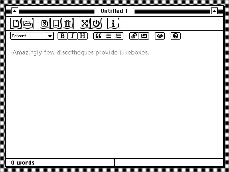
HelloEdit is a fully functional wrapper for the lovely Markdown editor EasyMDE by Jeroen Akkerman. I've taken a lot of opinionated liberty with the styling of the Markdown writing area, opting for a starker, less WYSISWYG interface which appeals to my Markdown-writing sensibilities. I drew all the sprites for the buttons and so forth myself - they're mostly direct copies from the original interface, so please don't sue me, retired 1980s Microsoft designers! It was a real joy to re-implement some of these lovely design decisions - I absolutely love the little spark/star sprite that appears when you click the minimise and maximise buttons, and the way the big buttons push down when you click them. Looking at the transition from monochrome to color displays on the old Macintosh computers, I really feel like a lot of the charm of the design was lost when colors were brought in. And that weird purple is kind of unforgivable.
 No.
No.
One of the most important part of any UI is the fonts, and I relied entirely on the stellar work of many other people to implement the fonts in HelloEdit. Of course, the person we all have to thank is Susan Kare, one of the original Apple designers, who created iconic fonts like Chicago, Geneva, and Monaco; the infamous Dogcow (Moof!); the Happy Mac and Sad Mac icons; and the Command key symbol. The two main fonts HelloEdit uses, ChiKareGo2 and FindersKeepers, are homages to her work by Giles Booth. For the actual editor, I find it difficult to read the jagged bitmap fonts used in the original Macintosh interface for long stretches of time - and in any case, it's impossible to anti-anti-alias fonts in modern browsers, for good reason. The default font is therefore one of my very favourite sans-serif fonts, Fira Sans, but I also included Fira Mono and three bitmap-ish fonts: TimesNewPixel, Tamzen, and a pixel font I made myself, modelled on New Transport by the amazing Margaret Calvert (appropriately called Calvert). In terms of other design, I lazily relied on FontAwesome to display the interface icons (I think they look great, honestly!).
I hope you enjoy it! I wrote this blog post in it, and I might try to write the remainder of my PhD in it, too...